a day's work

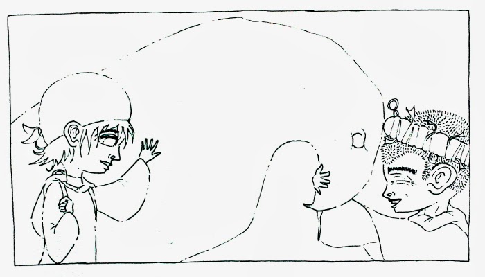
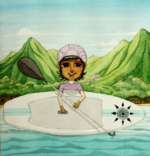
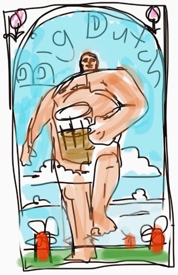
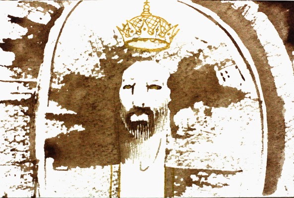
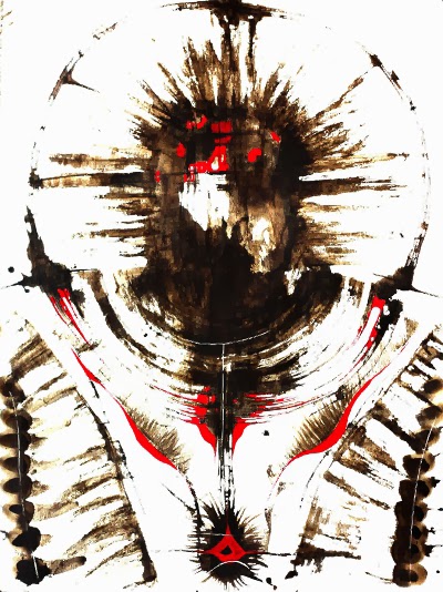
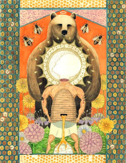
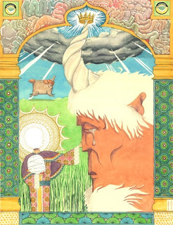
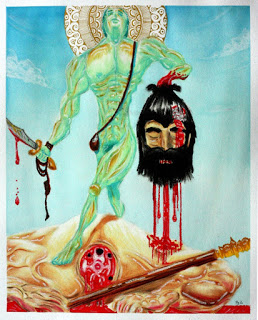
I think it's a sign that I'm still trying to challenge myself to improve when each finished illustration makes me pause and think "Heythatlooksprettygood!...Did I actually do that?" Which brings us to page 26:


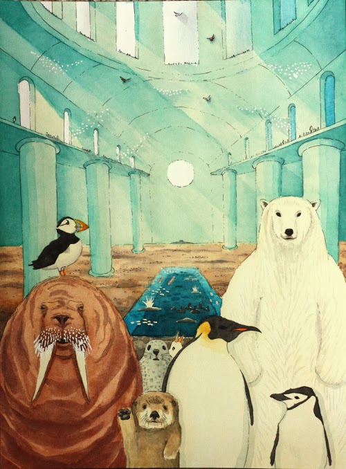
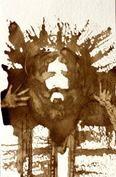
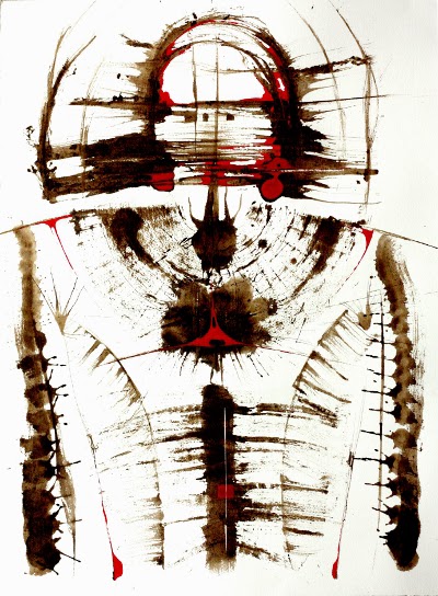
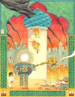
I had planned to use paint to create a simpler, more impressionist design for this page . For whatever reason, I decided to buckle-down and make the piece as detailed and explicit as possible using pen. I love the way it turned-out.

Viking expedition contest entry!!(?)

I just entered a short video contest for place on an a voyage to an ACTUAL patch of plastic marine debris in the Atlantic. The expedition, conducted by the 5 Gyres Institute, will be in June, and it seems like a great opportunity to increase awareness of this important environmental issue, as well as my current book.  

Here's the (terrible) video I made for the contest!:


If you're pickin' up what I'm puttin' down, please vote for me on the 5 Gyres Institute contest site !!!HERE!!!
You can vote once a day until the contest ends, please vote early and often. Thanks for your support!

<3 span="">

MoonriseMoonset

This is detail from a piece I entered into a group exhibition at Matthei Botanical Gardens late last year. These photos were taken in 2013, and for the exhibition I put them in a frame I found in an abandoned house outside of town.

The title of the exhibit was "50 Shades of Green" and challenged artists to interpret and explore the color green. It was a fun theme; this was my artist's statement displayed with the piece:

"MoonriseMoonset - Luna moths (Actias luna) emerge from their cocoons mouth-less. They have a week to mate, and then they die. In the top photograph, we see a male at the height of his splendor. Surrounded by the lush foliage of early summer, he hangs from a leaf, coupled to his mate. In the bottom photograph, we find a decaying Luna, perched on a mushroom in early autumn. The colors and telltale markings are still visible, leaving us to ponder the week during which those delicate, green wings were perfect, and the promise of life was at its fullest." 

The grind

Just finished painting page 25 of the new book. I might take a break tomorrow to focus on some of the less-creative aspects of this artist/author/illustrator life (taxes, shipping orders out, website stuff, taxes, TAXES).

I ain't even mad tho: motivation is still high, and there's plenty of chocolate milk in the fridge. Here's a glimpse of the last few days.
WIP + love for my corporate sponsors (not actually)  
A quick word about gear, if I may: I've definitely fallen out-of-love with my stockpile of Pigma Microns. I've amassed a rather impressive arsenal since my "Woodcutter" days, but I think the time has come to transition towards pens that...how can I say...don't start inexplicably leaking all over the work? So, let me introduce you to my lusty new partner: Copic Multiliner.


What I like:
  • Refillable (less plastic waste - BAM)
  • Replaceable tips 
  • Aluminum barrel
  • Water-based pigment ink - archival, waterproof, lightfast
  • and lastly...LEAK-PROOf
So, as my dear Microns rupture, one by one, I will replace them with various sizes of Multiliners. 

New book - illustration samples

Here are a few snique-piques from my current project. I'll not go into too much detail about the illustration, except to say that the style is a bit more "realistic" than The Woodcutter. Each page (currently on 24 of 40) has had unique challenges, and these have encouraged me to grow and develop my craft in ways I'd not anticipated.


Japanese Cranes

A gift for a friend
Symbols of luck, longevity, and fidelity. I'll be painting more of these, I think. The red squares were made using a stamp, called a hanko, which has a reading of my name in kanji. It was a gift from a co-worker in Japan; using it brings back many fond memories of my time spent there.


Tell me what you REALLY think

I was looking through some old dummies I'd submitted when I was trying to get "The Woodcutter" published, and found something pretty hilarious:

You can vaguely make out some text on the first page. Someone must have scribbled a note on a piece of paper, which left an impression on the plastic cover of the front portfolio sleeve.  I'm not sure which publishing house/agency this particular portfolio went to, but here's what someone over there thought of my book, as it was making the rounds:

Pass - the art doesn't wow me enough + PB w/out child protag is hard sell -RS 

Kinda neat to get that little glimpse of a true, honest reaction from within the industry.

Beer label - BIG DUTCH

A few weeks ago, my cousin floated the idea of me designing a beer label. A colleague was turning 60, and to mark the occasion, he was going to brew a batch of beer, to be named "Big Dutch."  I'd never designed a beer label before, but the project intrigued me and it seemed like a good challenge (not to mention a nice element to have in my portfolio).  He gave me full latitude in designing the label, which was much appreciated.  I used an iPad app called ProCreate to whip-up a first draft:

Having gotten the composition worked-out, I got the paper and watercolors out, and ended-up moving away from the enormous naked guy:

A beer brewed with Steenstra's windmill cookies.  Mmmmmmm 
 I love the way the tulips and brickwork turned-out.  This was a really fun illustration project, and I would definitely not shy away from doing more beer labels in the future.  With the incredible popularity of craft brewing in Michigan, I'm sure the opportunities are out there.

Negative space

Effective use of negative space has always been a challenge for me.  It's the idea of defining space and form by creating boundaries; it's allowing the viewer to infer shape and substance from the spaces you left blank.  To me, effective use of negative space is a sort of "addition by omission" in the same way that carving or etching is "addition by subtraction."
Here's an example from a master:
Arthur Melville (1858-1904), "Kurrachan"
Here are some examples from some guy with a blog (me):


A few more words on black walnut ink

I did some looking around, and it seems that many people who make their own ink have noticed two wonderful properties:

1.)  Excellent light-fastness (resistance to fading over time with exposure to light)
2.)  Increasingly waterproof over time.  This is great, because it allows for some tinkering before the ink completely sets permanently.

Most recipes also, it seems, include a dash of clove oil or whole cloves (to help improve the somewhat funky smell).  

Another:
30" x 22"
black walnut and gouache on 140 lb. Winsor & Newton Cold Press sheet

Homemade ink!

These are my first paintings of 2014, done with my first ever homemade ink (black walnut - see previous post).


All of these were done on 22" x 30" sheets of Winsor & Newton Paper (Hot Press, 140 lb.).  This is probably the finest paper I've ever used...I bought a bunch on-sale during Thanksgiving break from an art supply store back where my parents live.

Having such large quantities of ink available (and large sheets of paper) allowed me to experiment with some new techniques and tools.


I also tried using some gouache I had bought on-sale along time ago.  I love the vibrant, opaque color, and I'm excited to experiment further.

Apparently, the color is "Carmine"
Happy New Year!!!1


Juglans nigra

pretty gross looking in here.
This is a cast iron cauldron of black walnut husks, happily simmering away on the stove (I waited for Elin to leave for lab before I began).  This process started last fall, with the collecting and de-husking of several pounds of black walnuts.  I packed the fresh husks into a bucket and let time and nature work their magic.  After all the husks had oxidized and turned black, I transferred them to the cauldron, covered them with water, and left them to marinate in their own putrescence for a couple months.  Things got pretty moldy (but surprisingly not-stinky), and this is what I ended-up with:
Can you believe this stuff is free??
So, one day, I decided it was time to take the next step: on to the heat.  After a few hours of boiling and reducing, I strained off all the liquid and was left with:
Ta-DAAAA!
A few jars of homemade black walnut ink!  I added salt to some jars and methanol to others, to prevent mold.  I packed the husks back into an empty paint can and stored it for a possible Round 2 of ink-making if I run out before the next crop of walnuts starts to fall next autumn.

A Unicorn for Elin

~13x15 in.  Coffee and ink on watercolor paper
My second, and dare I say more successful, attempt at painting with coffee.  I painted this for Elin muuuuch earlier this year, and I just got around to getting it matted and framed.  I found the frame (oak, with a nice finish) a long time ago...either on a curb, or in a dumpster.   Apparently they were all the rage in the latter half of the 20th century, according to the folks at the local frame shop.

ArtPrize 2013 Entry

"A Triptych of Icons"
Venue: Monroe Community Church (800 Monroe Ave. NW)


16" x 20"
watercolor and ink on Arches hot press paper

Artist Statement:  

“A Triptych of Icons” is a brief glimpse of a larger, as-yet unimagined, story.  The characters, settings, and the larger world they inhabit are presented here without any context, save what the viewer chooses to create for them.  I have some vague, ill-formed notions about what the larger narrative behind these pieces might be, but I present this little snapshot with the hope that viewers can wonder and create stories for themselves.

The vibrant colors and intricate patterns are meant to resonate with familiar, perhaps nostalgic ideas of beauty, while the grim, surreal elements of the iconography are meant to be a bit unsettling.  Hopefully, the overall effect compels people to linger just a moment longer as they attempt to reconcile the seemingly contradictory impressions.  

My first goal is to show people something new.  Beyond that, I would like for viewers to see something they can appreciate as being beautiful and imaginative, but that also challenges and knocks them off balance just a little.  Hopefully the experience enriches folks, and a small piece of it can persist in some dark, beautiful corner of their memory.

Art in the Park - Tecumseh, MI

 This event was brought to my attentions by a post on the Facebooks earlier in the spring.  I applied for a spot despite my reservations about having to pay a $100 booth-fee if accepted.  Happily, after the first day, I find myself comfortably in the black.  The community seems really supportive, and the attendance yesterday was great.    
 The organizers at Community Arts of Tecumseh are totally killing it with this event (their first).  The location is perfect, the event promotion was very strong, they've been really supportive, and the weather has been gorgeous.  I give them credit for all four.  I'm looking forward to spending one more day in the park and would love the opportunity to come back next year.
Can you spot 5 skydivers and one airplane?
One of the unexpected perks has been watching skydivers drift earthward all afternoon.  The park is adjacent to Skydive Tecumseh, and they must have been BUSY yesterday.  There were planes taking off constantly flying just overhead.  And then, a few minutes later, we could see little black dots against the clouds and blue sky.  Those dots grew larger, until we could clearly see parachutes with people (probably pooping their pants) dangling beneath.  

Oil pastels

I can honestly say I haven't used oil pastels since graduating from high school.  I kinda fell in love with the things in my mid-late teen years because they were easy, fast, and the colors were incredibly vibrant (wait...we're still talking about pastels, right?).  Then I stopped, for some reason, and pretty much stuck to watercolor for the past 10 years or so.

Well, yesterday I broke out a set of Holbein pastels I bought a couple years ago (but had yet to use), and did this:
Goliath and the Shepherd  (16" x 20")

It was a blast to get back into these soft, oily crayons.  Also, it was pretty cool to be able to start and finish a piece on the same day...which almost never happens with aquarelle.  The background is a watercolor wash with white pastel over.  It's so nice to not have to worry about washes bleeding into finished areas...it's almost like oil and water don't mix.

There are definitely some things about this piece that need work, but it felt great to get re-acquainted an old flame from those halcyon days of youth.

Bloodbloodbloodbloodbloodblood..