"Robb N. Johnston"

can't WAIT to roll around town with these on.

I'm really starting to like spray paint. Krylon's Fusion line works on plastics and has a pretty neat selection of colors; I'm especially pleased with how the gradient turned-out. I tried to minimize and simplify the Sharpie work so it'll be easier to touch-up as the finer line-work fades. I gave my previous set of wheel covers to Big Matt after he trued my wheel following a little bang-up at polo a few weeks ago.

I still have 2 blank discs of corrugated plastic and a head full of corrugated ideas. I'm thinking some sort of crest or cost-of-arms for Ann Arbor bike polo. We shall see.
Published with Blogger-droid v1.6.3

Pressprize prints available


SIGNED, NUMBERED print of the painting that won the 2010 Grand Rapids Press 'Pressprize.'  Entirely decent reproduction on some of the most satisfactory paper available.  I've gotten countless requests for prints (actually, just the 1...thanks Mrs. H!) and I figured maybe some other folk might also be keen on a little slice of local ArtPrize something-or-other.

Paper: 17" x 11"
Image: 15" x 11"

I'll get 50 of these guys, individually signed and numbered.  

$25 each, shipped to you in a tube.  If you'd like one, hit me with an email at robertnjohnston@gmail.com or on Facebook so as we can work-out the details.  
In your email or FB message, please use the subject: "Pressprize print"

Front cover finished

I finished the cover illustration for "The Woodcutter and the Most Beautiful Tree" earlier this week and took it to the printer to get some digital scans and a print.  Now, hopefully, I can start working on getting the book to press.  


I think I'd like to have the text off to one side, like this:


"Anansi the Spider" and "Arrow to the Sun," both by Gerald McDermott, were two of my favorite books as a child and remain great sources of inspiration for me as one who aspires to be an artist, author, and illustrator.  The illustrations are beautifully done (Caldecotts all day, son) and the stories are sweet and simple re-tellings of old folktales.  If you've not read them, do yourself a favor and check them out; they are timeless classics.


Artprize

Elín and I went to Artprize this weekend with my sister and her boyfriend.  As of this writing, the contest has been narrowed down to 10 finalists from the original 1700+.  I was extremely impressed by the quality of work (for the most part) and it generated some interesting conversation with friends and family (Bigger = better?, art vs. craft, etc.).  My favorite venues were the Grand Rapids Art Museum and the Public Museum.  Some of my favorite pieces:


 This was an installation by Melissa Leitch.  She's the mother of a childhood friend and, as you can see, an amazing artist.  Awesome job, Mrs. L!

Portrait iii

 Another Beksinski-inspired portrait.  This painting is unique in that it was my first-ever experience with india ink.  The stuff is inCREDible.  Here are a couple images to get the general idea across.  Full pic to follow.


I also finished a commissioned piece for an old friend.  I'm not sure if she'd want me to post the image on the ol' blog, but if she gives her permission, I'll post some pics in the near future.

Today is the day(!)

HAPPY START-OF ARTPRIZE, EVERYONE!!!


I have yet to see the paper...but there is a nice write-up (accompanied by a well-taken photo of a goofy-looking guy) on mlive.  Please CHECK IT OUT!  Thanks to everyone for the kind words and congratulations.  You're all the best!  Special thanks: Selina - For making me do it.  The folks at the Grand Rapids Press - For providing such a cool opportunity to participate.  And Elin - For letting me borrow her car.

...And for being cool when I broke it.

<3


EDIT:  Here she is!!!


GR PressPrize contest entry

The Grand Rapids Press (the big newspaper from back home) offered local artists a chance to get involved in the run-up to ArtPrize 2010 by calling for front page designs.

The Rules:

-  10.75" x 13.5~15"
-  Due Sept. 11th
-  "Capture the the excitement that ArtPrize brings to our region."

A winning design will be selected and put on the front page of the Sept. 22nd edition (that's next Wednesday!), with other submissions appearing elsewhere in the paper.  It took me awhile to decide on a composition...but I like what I finally came-up with.  Win or lose, I think I put my best effort into this one and I'm grateful to have had the opportunity.  Fingers crossed!


Published with Blogger-droid v1.5.9

samples


I put these here as reference for literary agents and publishers who may be interested in publishing or representing my work: "The Woodcutter and The Most Beautiful Tree."
.
These are pictures taken with my digital SLR.  They get the basic point across, but the colors are a bit off.  PDFs of high-resolution scans are available on request (beware, they're huge files).
.
The original works are on Bienfang 11" x 15" 140 lbs. cold-pressed watercolor stock.
.   
There are 19 two-page spreads and the last page stands alone for a total length of 39 pages.

Thanks for looking!

The Woodcutter and The Most Beautiful Tree

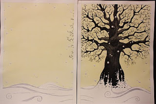
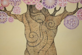
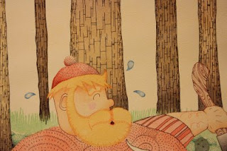
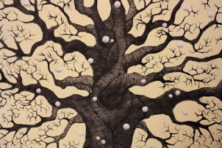
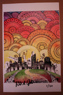
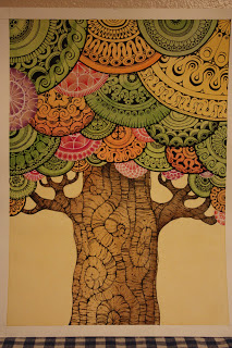
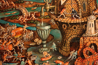
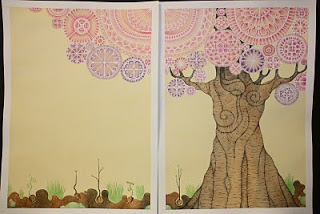
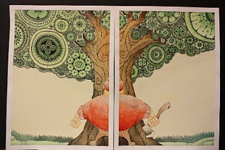
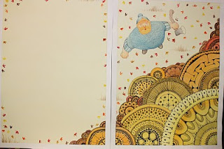
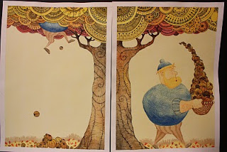
These pictures highlight the detail of the illustrations I've been working on and (hopefully) give a general impression of the style I'm trying to achieve for the book.


All 39 of the pages for the story were painted on 11" x 15" Bienfang 140lb. cold press watercolor paper (none of my materials were what would be considered "professional-grade"...but I think the results were about as good as I could have hoped for).


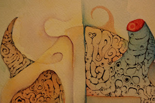
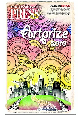
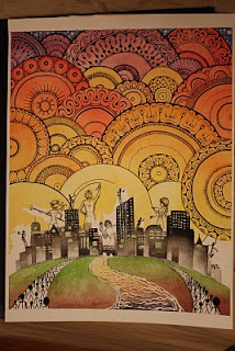
I used a warm, yellow wash on all the pages (the "recipe" for the wash varied somewhat...some washes have a cream-color to them while others seem yellow-er). I did this to soften the negative space and to try adding a richness to the colors.


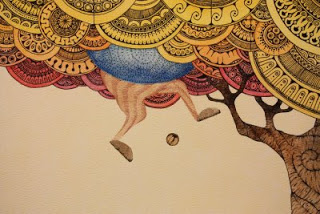
After outlining, washing, and painting I went back and did the ink work. In truth, this whole story (and everything that has followed) was inspired by these ultra-fine pens I was introduced to in Japan. The finest details required 0.20mm pens and the bolder areas up to 0.45mm. Painting in general, and watercolor specifically, can be a bit intimidating for me...but going through page after page with pens placed me squarely in my comfort zone.


So! I guess that's about it for now. I hope you have a basic idea of what my little illustration project is all about.

[Must apologize for the quality of the pics...the colors are pretty far off in the photos. But the patterns, details, and forms come through OK, I think. I hope to get some high-quality scans in the future.]